https://www.nationalgeographic.com/magazine/2018/05/genius-picasso-art-categories-infographic/
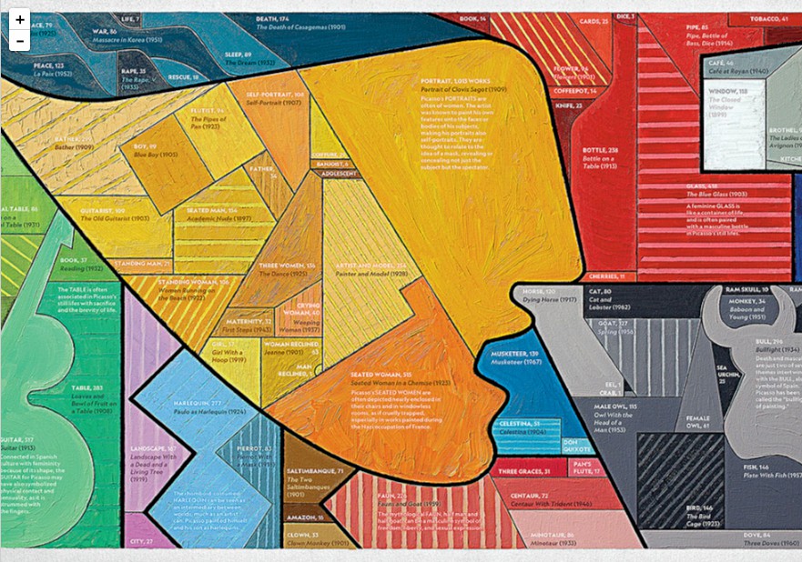
This visualization presents the works of Picasso in Spanish. It was created after analyzing 8,000 Picasso’s works using Picasso techniques and it’s a kind of Convex Treemap. Painted on a canvas, it encodes the number of works that Picasso worked on a given theme by the area of partition. The larger partition is, the more works that he created. The 12 major themes and subcategories are encoded with different color hue, grain, shapes and positions.
Why this visualization impresses me? In one word, the visualization builds a bridge between Picasso’s art styles and us. For instance, we can see there is a woman face in the middle of the picture. She has eyes, nose and even mouth. Zooming this part, we can see more details. Picasso prefers using orange-yellow and pieces objects to paint human faces. And he’s good at using the combination of pieces to reflect human’s emotion. This is his style and the design of this visualization imitates it. The shape, color and grain of each visualization category are related to the arts styles that it belongs to.
Yes, we can have an overview about Picasso’s works distribution through watching the partitions size and distribution. The encoding scheme is efficient. However, more importantly, the visualization itself is a work, a reproduction of Picasso’s arts, a kind of respect to master Picasso. The color, size, shape and grain —- all these elements not only display the data, but also show the Picasso’s arts styles and his individual spirit on arts. What this visualization conveys is meaningful. We can see all the Picasso’s art styles in one picture. It seems that it brings Picasso back to life and make all of us feel the glory of Picasso in the past.