Data visualization is the most relaxing class among this term. Pro. Huamin Qu is a humorous, gentle and kindly guy. On the HKUST VisLab, I can see he gets along well with students and they just have held $15^{th}$ VisLab anniversary along with his $50^{th}$ birthday.
In the first class, Pro. Qu said that this is a class where you can feel the beauty of data science, where you can escape from the sophisticated math maze for a while. Display the data like telling a story, he also said. You can feel what’s meaning by watching this youtube video BBC: The Joy of Stats - Rosling’s 200 years’ human history in 4 mins
The core value of data visulization is that computers do what computers are good at and humans do what humans are good at. For example, one of their team’s works CSE PQE-defense System help supervisors check their students (MPhile or PhD) information more easily.

Computers are good at computing. It liberates humans from the tedious and boring jobs and let them do more creative works. I think it’s more delightful to to draw a colorful pictures than sitting in front of desk calculating infinite data.
1 Humans’ Visual System and Cognition
Our humans visual system is efficient to process image information. The world memory masters in the TV show do use visual memory and imagination to memorize massive information such as poker, faces, color and etc. And I believe that we recite poems and english words by imagining a pictures in our school days. We also prefer to use charts and diagrams to display clear message rather than show raw data.
Whatever the CSE PQE-defense System or the charts we draw, essentially speaking, we want the information (data, perceptions, values, sensation) in our mind can be transfered to others’. The viusalization is only a method, the information conveyance is the key. In the Data Visualization, we call this kind of information cognition and we also use the term cognition conveyance. For example, blue dots in the following picture make us feel stable and calm but we feel unstable and anxious when seeing red dots. We can use colors and shapes to convey a kind of state and even a kind of feeling.
Stuart K. Card (born c. 1946), an American researcher and retired Senior Research Fellow at Xerox PARC, is considered to be one of the pioneers of applying human factors in human–computer interaction. He said,
Visualization is really about external cognition, that is, how resources outside the mind can be used to boost the cognitive capabilities of the mind.
He hit the point of what visualization really does and how visualization play an important role in cognition conveyance.
2 The Features of Humans Visual System
To take advantages of humans vision, we need to know more about the features of humans visual system. We have already talked about its high efficency in handling large amount of image data.
- efficient to process massive image information
Now we discuss the following features that
- sensitive to distinguished elements
- will focus on something and neglect something
- have illusions
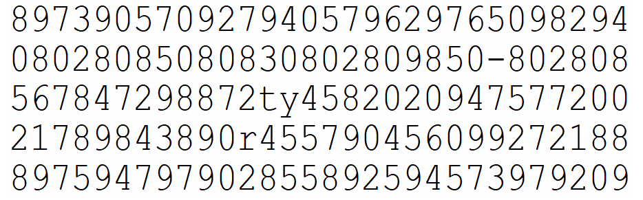
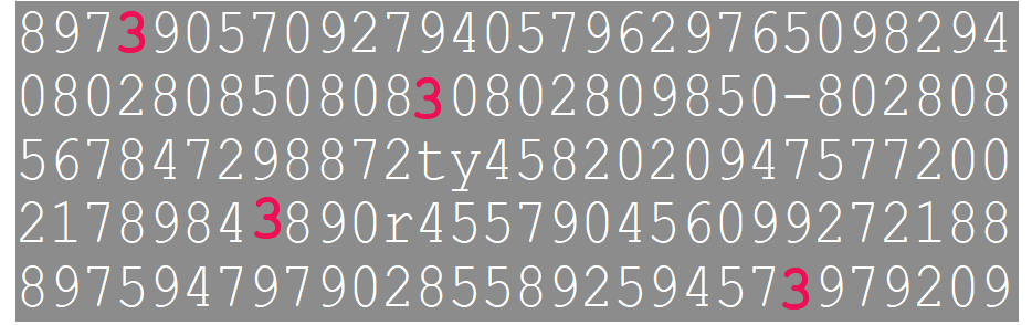
The application of the first effect is the pre-attention processing. Look these two pictures to find how many 3 appears. Give me the answer as soon as possible.
It is what humans good at processing image data but this not means that it’s sensitive to all things. The visual system pays more attention to prominent objects, proceesing them first. The more irrelevant items, the more times the system responses for.
The second feature has two famous experiments - the invisible gorilla and the monkey-business illusion. The first experiment shows when people focus on something they may fail to notice other things happen at the same time. The second experiment shows that if ones know that something unexpected might happen, and are likely to negelect other unexpected events.
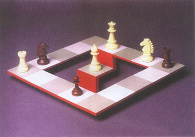
The third Illusions. We can see this is an impossible chessboard which is against the laws of physics. This is a kind of illution from specific angle.
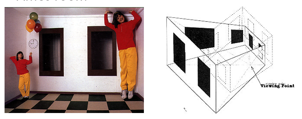
We also have the Ames room to show optical illusion. Two girls are the same person but they look completely different, don’t they? One is giant the other is tiny. What reason makes this happen? . Although the room looks pretty normal, it is specially designed as a six-sided convex polyhedron and things in the room are distorted. The reason we look it normal, it’s that we are forced to look through a peephole.
3 Color
Color Space and Color Model
| Color Model | Meaning | Usage | Color Space |
|---|---|---|---|
| RGB | red, green, blue | media and equipments that transmit light | RGB color space |
| HSV | hue, saturation, value | is similar to HSV faced to user but the third parameter is different | HSV color space |
| HSI/HSB/HSL | hue, saturation, itensity (brightness/lightness) | is derived from humans visual system, shows humans direct sensation to colors | HSI color space |
| CMYK | hue, saturation, value | printing industrial, ink | CMYK color space |
| CIE XYZ | CIE is International Commission on illumination, they found RGB standard has Negative Intensity so they built a new colormetric system using XYZ primary colors. Display all colors that humans can see. | a standard for colormetric system | XYZ color space —> transfer —> LUV color space, used to illustrate or quantify relative color differences |
| CIE Lab | Light, a(green to red), b(blue to yellow). Another model proposed by CIE, improving XYZ model | digital way | Lab color space |
Rules for Color Scheme
The maximum number of colors which can be used is usually between 6 to 12. The 12 recommended colors1
2
3Red, Green, Yellow, Blue
Black, White, Pink, Cyan
Gray, Orange, Brown, Purple
There are some rules about using colors:
Use differing hues for qualitative data
Use continuous variation for quantitative data
Limit color numbers ( 5 - 10 is OK )
Don’t have blue and red together
Be careful with blue (small blue objects, blue objects on dark background). Our eyes are not sensitive to blue
Red-Green are good color combinations. For people with red-green color blindness, Yellow-blue are usually OK.
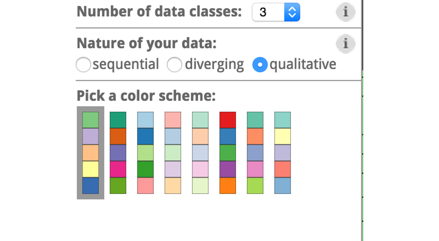
Choose Color Scheme According to Data Nature
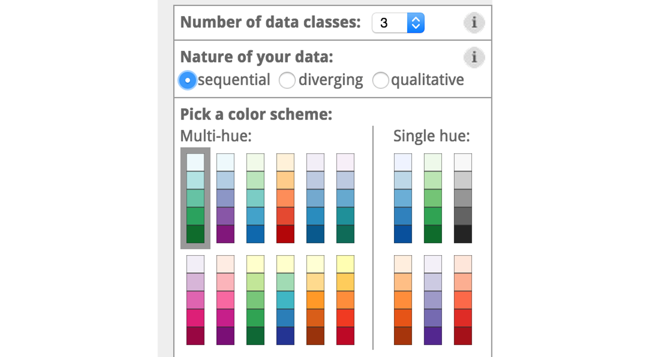
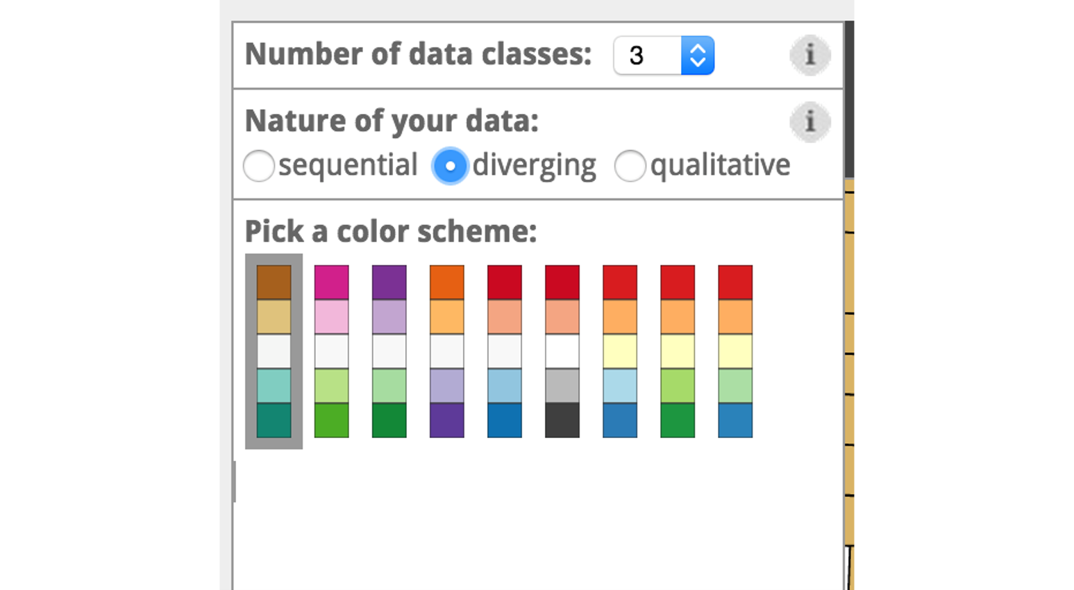
In the colorbrewer 2.0, it divides the data scheme into three types and uses different color scheme to code data.
- Sequential
- Diverging
- Qualitative
Sequential schemes are suited to ordered data that progress from low to high. Lightness steps dominate the look of these schemes, with light colors for low data values to dark colors for high data values.
Diverging schemes put equal emphasis on mid-range critical values and extremes at both ends of the data range. The critical class or break in the middle of the legend is emphasized with light colors and low and high extremes are emphasized with dark colors that have contrasting hues.
Qualitative schemes do not imply magnitude differences between legend classes, and hues are used to create the primary visual differences between classes. Qualitative schemes are best suited to representing nominal or categorical data.
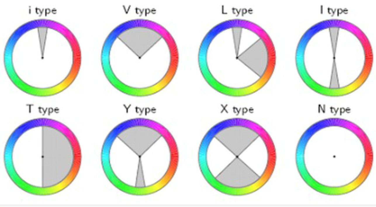
Color Harmonization
Color Meanings
| Colors | Symbols | Examples |
|---|---|---|
| Red | Adventure. Energy. | Coca Cola |
| Pink | Compassion. Nurturing. | Breast Cancer Research Foundation; Barbie |
| Orange | Cheerful. Warm. Optimistic. | Amazon |
| Yellow | Happy. Bright. Sunny. | McDonalds |
| Green | Health and Healing. Environment. Organic. | Whole Foods Market; Starbucks |
| Blue | Honesty. Trust. Dependability. | Facebook; Pfizer |
![]()
Watch for culture conflicts. For example, the red in dragon. The dragon is symbol of good fortune and emperor in the East. Many East Asian deities and demigods have dragons as their personal mounts or companions. So red means good fortune and nobleness attached to dragon. However, in western culture, dragon is described as a monster hiding in deep caves that warriors eager to conquer. They are always associated with evil, magic, darkness and power and guard thouands of treasures. Therefore, the red has a bad impression with dragons.
4 Visualization Principles from Tufte - Not to Lie
Tufte’s Rule Visual attribute value should be directly proportional to data attribute value
How not to lie
- Show entire scale
- Show data in context
- Consistent, linear scale
- Log scale for log data
- Up vs. down: indicate direction of improvement
- Avoid size encoding
- Use height OR width
- Don’t use both for same data attribute
- Avoid area, volume encoding
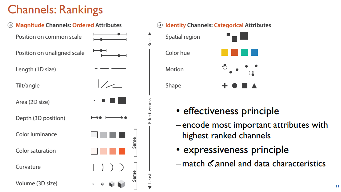
5 Data and Visual Channels
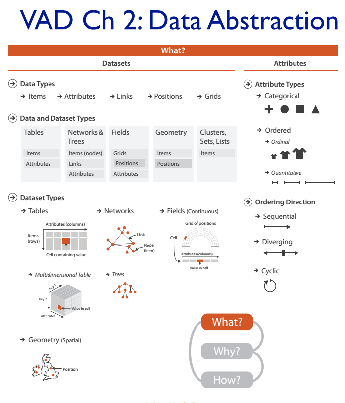
Data can be abstracted to data and dataset. Data types are items, attributes, links, positions and grids. Dataset types are tables, networks & trees, fields, geomotry, clusters, sets and lists. And attributes have types and direction.
The most important two definitions are marks and channels. Marks are geometric primitives like points, lines and areas. Channels control appearance of marks such as position, color, shape and size. If we encode most important attributes with highest ranked channels, our visualization would be more effective.